Dictation Badge
Last Updated: September 2026Dictation badges toggle voice capture for note-taking flows, with optional waveform or levels feedback while listening.
 Source Code
Anatomy
link- 1Idle icon
- 2Indicator
- 3Stop icon
- 4Toggle
Variants
linkDefault
Idle badge waiting to be pressed.
Active waves
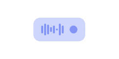
Pressed state with the default waves indicator.
Active levels
Pressed state with the levels indicator.
Disabled
disabled prevents toggling pressed state.
Controlled
Own pressed state with pressed + onPressedChange.
Usage Guidelines
linkWhen to use
- •To start and stop voice dictation in note-taking or scribe flows.
- •When a compact badge with waveform or levels feedback communicates listening state.
- •Inline near the field that will receive transcribed text.
When not to use
- •For generic play/pause media controls — use Icon Button.
- •For unrelated binary settings — use Switch or Toggle Button.
- •When microphone access is required but you cannot surface permission or stream errors.
Always provide an aria-label that names the dictation action.
Don't omit aria-label — the control has no visible text.
Place the badge next to the field that will receive dictated text.
Don't reuse DictationBadge for mute, call, or media controls.
Behaviors
linkPressed state
- •Uncontrolled: defaultPressed.
- •Controlled: pressed + onPressedChange(boolean).
- •While pressed, the badge expands and swaps the idle icon for the indicator + stop icon.
Indicators and stream
- •indicator defaults to "waves"; pass "levels" for discrete bar opacity feedback.
- •Pass stream (MediaStream) with audio tracks to animate the indicator from live input.
- •Without audio tracks, bars reset / stay at the idle scale — the pressed chrome still shows.
Disabled
- •disabled blocks pointer and keyboard activation.
- •Disabled styling uses transparent background and disabled foreground tokens.
Content Guidelines
linkLabels
- •Prefer action-oriented aria-labels such as "Toggle dictation" or "Start dictation".
- •Keep labels free of PHI — describe the control, not a specific patient or note.
Feedback
- •Surface microphone permission failures near the control with plain secondary text.
- •Use synthetic demo copy only — never real clinical note content in docs or fixtures.
Accessibility
linkText & Labels
- •Provide aria-label — there is no visible text label on the badge.
- •Default aria-label is "Toggle dictation" if omitted; still set an explicit label in product UI.
ARIA attributes
- •Built on Base UI Toggle — exposes pressed state to assistive tech.
- •Wave and level bars are aria-hidden decorative indicators.
- •Icons are aria-hidden; the toggle's aria-label is the accessible name.
Keyboard Support
- •Tab → focus the badge.
- •Enter / Space → toggle pressed.
- •Disabled control is not focusable for activation.
WCAG Compliance Standards
FAQs
linkHow do I animate the indicator from the microphone?
Pass a MediaStream with audio tracks via stream while pressed. Stories show getUserMedia wired through pressed + onPressedChange.
waves vs levels?
waves continuously scales bar heights from audio analysis; levels lights a discrete count of bars. Default is waves.
Can I put children inside DictationBadge?
No. Children are not part of the public API — icons and indicators are built in.