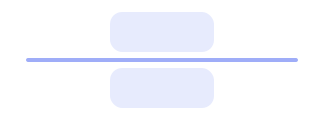
Divider
Last Updated: September 2026Dividers are subtle visual cues that separate different blocks of information or actions from one another.
 Source Code
Anatomy
link- 1Separator
- 2Orientation
Variants
linkHorizontal
Default. Full-width 1px rule between stacked content.
Vertical
1px rule that stretches with a flex row (self-stretch).
Usage Guidelines
linkWhen to use
- •To visually separate stacked sections, form groups, or list blocks.
- •As a vertical rule between inline actions or nav clusters.
- •When whitespace alone is not enough to mark a content boundary.
When not to use
- •To replace semantic headings or landmarks — keep real structure.
- •As a decorative border on cards — prefer the surface’s own border.
- •Between every list row when spacing or zebra styling already separates items.
Use a divider between distinct sections, not mid-sentence.
Don't stack dividers back-to-back — they add noise without hierarchy.
Pair vertical dividers with a stretched flex row so the rule has height.
Don't place a vertical Divider in a non-stretching layout — it may collapse.
Behaviors
linkOrientation
- •orientation defaults to horizontal (aria-orientation=horizontal).
- •vertical sets aria-orientation=vertical and uses a 1px width with self-stretch.
Styling
- •Uses border-subtle background; height/width come from orientation data attributes.
- •className merges through composeCn for state-aware overrides.
Content Guidelines
linkPlacement
- •Prefer one divider between major blocks, not after every paragraph.
- •Keep equal spacing above and below horizontal dividers.
Meaning
- •Dividers are visual only — they do not create headings or regions.
- •There is no decorative prop; the control always exposes role=separator.
Accessibility
linkText & Labels
- •Divider does not require a visible label.
- •If the boundary needs a name, use a heading or aria-labelledby on surrounding structure instead.
ARIA attributes
- •Renders with role=separator and aria-orientation matching the orientation prop.
- •Base UI Separator has no decorative prop — do not invent one; keep the accessible separator role.
Keyboard Support
- •Not focusable — purely presentational in the tab order.
WCAG Compliance Standards
FAQs
linkIs there a decorative prop?
No. Divider wraps Base UI Separator, which only documents orientation. It always renders as an accessible separator.
Why is my vertical divider invisible?
Vertical rules need a stretched parent height (flex + align-items: stretch or an explicit height). Alone they have no intrinsic height.
Can I change the color?
Override via className. Default fill is border-subtle; keep contrast for low-vision users.