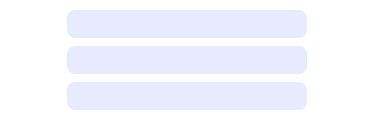
Stack
Last Updated: September 2026Stacks arrange children horizontally or vertically with consistent gaps, alignment, and responsive direction.
 Source Code
Anatomy
link- 1Root
- 2Children
- 3Align / justify
- 4Stack.Item
Variants
linkVertical
Default direction with a gap between children.
Horizontal
Row layout with shared alignment.
Align and justify
Distribute items along the main axis and align on the cross axis.
With Item grow
Stack.Item grow fills remaining space in a horizontal stack.
Responsive direction
direction and gap accept mobile / tablet / desktop objects.
Usage Guidelines
linkWhen to use
- •To space children vertically or horizontally with consistent gaps.
- •When align/justify and responsive direction simplify layout.
- •As a lightweight alternative to one-off flex utility wrappers.
When not to use
- •For complex CSS grid layouts — use dedicated grid structure.
- •When a single child needs no spacing — omit the Stack.
- •As a semantic list — prefer ul/ol or domain components.
Use the sp scale for gap and padding (e.g. gap={4} = 16px).
Don't set style on Stack — it has no style prop. Wrap in a div for width/height.
Use Stack.Item grow when one child should absorb leftover space.
Don't nest many Stacks for simple rows — one horizontal Stack is enough.
Behaviors
linkDirection and gap
- •direction defaults to vertical; horizontal lays out in a row.
- •gap uses the design-system sp scale: 0 | 0.5 | 1 | 1.5 | 2 | 3 | 4 | 5 | 6 | 8 | 10 | 12 | 14 | 16.
- •Props can be Responsive objects: { mobile, tablet, desktop } (tablet → md:, desktop → lg:).
Spacing props
- •padding / paddingVertical / paddingHorizontal / paddingTop|Right|Bottom|Left.
- •margin variants mirror padding and also accept "auto".
- •More specific sides override broader padding/margin props.
Items and render
- •Stack.Item supports grow and shrink (boolean or responsive).
- •render replaces the root element via Base UI useRender (default div).
- •Stack does not accept style — wrap in a div when you need explicit width or height.
Content Guidelines
linkStructure
- •Prefer a single Stack per section rather than wrapping every pair of siblings.
- •Keep demo children synthetic (labels, tags, buttons) — no PHI.
Accessibility
linkText & Labels
- •Stack is a layout primitive — accessible names belong on interactive children.
- •If the stack represents a toolbar, label the toolbar region or its controls, not the Stack.
ARIA attributes
- •Default root is a generic flex div (data-slot="stack").
- •Do not rely on Stack for list semantics — use ul/ol when order matters for AT.
Keyboard Support
- •Non-interactive — Tab order follows focusable descendants.
- •Maintain a sensible visual and DOM order when using justify space-between.
WCAG Compliance Standards
FAQs
linkCan I pass style to Stack?
No. Stack does not expose a style prop. Wrap it in a div (or use className / render) when you need width, height, or background.
How do responsive props work?
Pass an object like direction={{ mobile: "vertical", tablet: "horizontal" }}. Missing smaller breakpoints fill downward from larger ones.
When do I need Stack.Item?
When a child must grow or shrink independently. Otherwise plain children with gap are enough.