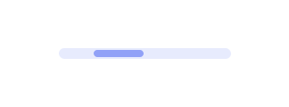
Bar
Last Updated: September 2026Loader bars communicate system status when content is loading or an action is processing. Both determinate and indeterminate visual styles are supported.
 Source Code
Anatomy
link- 1Track
- 2Indeterminate fill
Variants
linkAccent
Default. Strong accent fill on a subtle track.
Neutral
Tertiary fill for quieter loading contexts.
Usage Guidelines
linkWhen to use
- •For indeterminate loading across a horizontal region (page, panel, table).
- •When a compact linear indicator fits the layout better than a spinner.
- •Inside headers or list rows where height is constrained.
When not to use
- •For determinate percent complete — Bar is indeterminate only.
- •For inline control loading (buttons) — use Spinner via Button loading.
- •When a circular indicator is clearer — use Spinner.
Give Bar a bounded width (parent or className) — it stretches to 100%.
Don't drop Bar into an unconstrained flex child without a width.
Use color="neutral" when accent would compete with primary CTAs.
Don't stack multiple accent loaders beside Primary actions.
Behaviors
linkIndeterminate only
- •Bar always animates; it does not accept a value/max progress model.
- •Native progress semantics with aria-label="Loading".
Sizing
- •Height is fixed (h-1); width is 100% of the parent.
- •Wrap in a sized container for demos and layouts.
Content Guidelines
linkPlacement
- •Place near the content that is loading, not as a global decoration.
- •Prefer one loader per region to avoid noise.
Accessibility
linkText & Labels
- •Default aria-label is "Loading". Override via props if the region needs a more specific name.
ARIA attributes
- •Renders a native progress element with aria-label for assistive tech.
Keyboard Support
- •Bar is not interactive and is not in the tab order.
WCAG Compliance Standards
FAQs
linkCan I show 40% complete?
No — Bar is indeterminate. Use a determinate progress pattern outside this component if you need a value.
Accent vs neutral?
Accent is the default brand treatment. Neutral is quieter for secondary panels.
Why is my bar full-bleed?
It is width 100%. Constrain the parent (e.g. w-64) or pass a width via className.