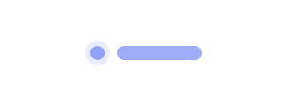
Dot Status
Last Updated: September 2026Dot statuses indicate the current stage an entity lives in. They are intended to be real time and support a variety of colors as well as custom labels.
 Source Code
Anatomy
link- 1Halo
- 2Dot
Variants
linkInactive
Not started / idle. Default label: Not Started.
Active
In progress. Default label: In Progress.
Success
Complete / healthy. Default label: Complete.
Warning
Needs attention. Default label: Warning.
Urgent
Error / blocked. Default label: Error.
Custom label
Override the default status copy with a context-specific label.
Dot only
Pass label="" to render the colored dot without text.
Usage Guidelines
linkWhen to use
- •To show a discrete process or record status at a glance.
- •In tables, lists, or headers where space is limited.
- •When color plus a short label communicates state clearly.
When not to use
- •For multi-step workflows — use Stepper.
- •For categorical labels without status meaning — use Tag.
- •For loading/in-flight work — use Spinner or Bar.
Pair status color with a readable label in dense lists.
Don't rely on color alone when the meaning isn't obvious nearby.
Use urgent for errors and name the consequence in the label.
Don't use urgent/warning colors with contradictory labels.
Behaviors
linkDefault labels
- •When label is omitted, DotStatus uses Not Started, In Progress, Complete, Warning, or Error.
- •Pass an empty string (label="") to hide the label entirely.
Layout
- •Root is a flex row with a small gap — nest freely in tables and cards.
- •children is omitted from the public props; use label for text.
Content Guidelines
linkLabels
- •Keep labels short (1–3 words) and status-oriented.
- •Prefer sentence case ('In review', not 'IN REVIEW').
- •Use synthetic demo statuses only — never real patient or claim identifiers.
Accessibility
linkText & Labels
- •Prefer a visible label so status is not color-only.
- •When using label="", ensure nearby text conveys the same meaning.
ARIA attributes
- •The root is a div — add aria-label if the status is not accompanied by visible text.
Keyboard Support
- •DotStatus is not interactive and is not in the tab order.
WCAG Compliance Standards
FAQs
linkHow do I hide the label?
Pass label="" — omitting label uses the built-in status copy instead.
What's the difference between warning and urgent?
warning is cautionary attention; urgent maps to the danger/error treatment (default label Error).
Can I put custom children inside?
No — children is omitted from the API. Use the label prop for text.