Skeleton
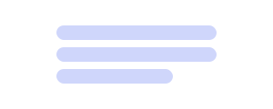
Last Updated: September 2026Skeletons reserve space while content loads, reducing layout shift until real data is ready.
 Source Code
Anatomy
link- 1Block
- 2Text line
- 3Width
Variants
linkDefault
Full-width bar at the default 16px height.
Typography-aligned
Height matches a Typography variant's line box.
Fixed block
Explicit width and height for avatars or media.
Random width
randomWidth (boolean or [min, max]) — mutually exclusive with width.
Usage Guidelines
linkWhen to use
- •To reserve space while content loads and reduce layout shift.
- •When matching Typography line-heights via typographyVariant.
- •For cards, lists, and search results awaiting data.
When not to use
- •For determinate progress — use a progress Bar instead.
- •For a spinner that does not reserve layout — use Spinner.
- •As permanent decoration — replace with real content when ready.
Match typographyVariant to the text that will replace the skeleton.
Don't use a tall block skeleton where a text line will appear — expect shift.
Mirror the final composition (avatar + lines) so transition feels stable.
Don't combine width with randomWidth — they are mutually exclusive.
Behaviors
linkSizing
- •Default width is 100%; default height is 16px.
- •With typographyVariant, height becomes calc(1lh - 4px) with small vertical margins.
- •Explicit height overrides the typography-derived height.
randomWidth
- •Mutually exclusive with width in the type system.
- •true → random percentage between 10–100%.
- •[min, max] → random percentage in that range; computed once on mount.
Motion
- •Uses animate-pulse on a soft rounded solid surface.
- •data-slot="skeleton" marks the node for styling hooks.
Content Guidelines
linkPlaceholders
- •Skeletons are empty — do not put PHI, names, or real copy inside them.
- •Vary line widths so multi-line placeholders look natural.
Composition
- •Group skeletons to match the loaded UI hierarchy (header, body, meta).
- •Prefer fewer accurate blocks over many decorative bars.
Accessibility
linkText & Labels
- •Skeletons are decorative while loading — announce loading state on the region, not each bar.
- •When content arrives, remove skeletons so assistive tech reads real text.
ARIA attributes
- •Consider aria-busy on the parent container while skeletons are shown.
- •Avoid labeling every Skeleton as a live region — that creates noise.
Keyboard Support
- •Not focusable.
- •Ensure focus moves to real controls after load, not leftover placeholders.
WCAG Compliance Standards
FAQs
linkwidth vs randomWidth?
Pass width for a fixed size (or percentage). Use randomWidth instead when you want a one-time random percentage — TypeScript forbids combining them.
What does typographyVariant do?
It applies the matching Typography classes and sets height from the line box so text swap-in does not jump.
Skeleton vs Spinner?
Skeleton reserves layout for content shaped like the final UI. Spinner signals activity without mirroring structure.